
My Role
User Research, Product Designer
Timeline
12 Weeks
Tools
Figma, ChatGPT, Canva, G-suite, Zoom
User research, Synthesizing Research, Sketching, Wireframing, Branding, Prototyping, User testing
Skills
IDENTIFYING THE PROBLEM
The outdated design and frequent crashes of FMB - (Faiz-ul-Mawaid al Burhaniyah’s) platform frustrated community members, highlighting the need for a modern, user-centric redesign.
Members of the Dawoodi Bohra community relied on the FMB website to check their weekly menus and customize their daily meals. However, the platform's outdated design, frequent crashes, and obsolete color scheme and layout made it difficult for users to access the essential culinary information they needed.
Faiz al-Mawaid al-Burhaniyah (FMB) is a culinary movement.
The establishment of 869 community kitchens across diverse towns and cities worldwide, DETROIT one of them, where Dawoodi Bohra community members reside.
Background
FMB Objectives
Nutritious meal: Ensuring every household receives a daily nourishing meal.
Empowering women: Providing time for entrepreneurial pursuits and career focus.
Community bond: Fostering equality through shared identical meals for all ages and backgrounds.
FMB Impact in Detroit - How many people are fed daily?
I conducted a thorough analysis of its visual and functional elements to identify its flaws, inefficiencies, and areas that need improvement.
The design is visually cluttered, with inconsistent alignment, outdated aesthetics and a lack of visual hierarchy, making navigation confusing. The interface is not mobile-friendly, and the pop-up forms are text-heavy and complicated, leading to poor usability.
Here’s what the website looked like and its key features included:-
Dissecting outdated FMB website - UX Audit
SOLUTION
Recognizing these challenges, I led a comprehensive UX/UI redesign project to develop a user-centric mobile application. In the first week after launch, the app achieved 170 downloads, demonstrating strong initial interest. Moreover, user engagement surged by 30%, reflecting improved usability and functionality.
Bridging tradition and technology: A cutting-edge FMB app designed with user experience at its core!
Unveiling the Journey: How We Got There
RESEARCH
To understand existing solutions, I conducted a competitive analysis of FMB apps used in various cities. This involved examining their features, user interfaces, and overall user experiences to identify best practices and areas for improvement.
Competitive Analysis
Goal: To understand the current state of the FMB platform, user behaviors, pain points, and potential opportunities for enhancement.
I interviewed 6 users, all of whom taking FMB services weekly. They ranged from working mothers to retired women. I also sat down with one of the admins to discuss the FMB statistics information.
User Interview
Key Research Questions
How often do you use the FMB website for managing your meal preferences?
What are your primary goals when accessing it?
What challenges or frustrations you've encountered while using the current FMB platform?
How often do you fill “survey monkey” to provide us with feedback of the food served?
How often do you volunteer at the community kitchen? And whats the process for sign up?

ANALYSIS AND INSIGHTS
Affinity Mapping
After obtaining the data, I organized all the interview notes into related groups based on common similarities. This visual representation helped me identify key themes and prioritize ideas.
I categorized these datas into 4 Themes:
Key Insights
Users heavily depend on the FMB website for weekly menu updates, adjusting food quantities based on preferences.
Repeatedly entering user ID and password details everytime they login is time-consuming.
Users communicate via email with FMB admins for addressing meal-related issues.
Users avoid providing food feedback due to the cumbersome process of filling out a separate survey form via email.
Community members express frustration over occasional missed cutoff time
(Inability to make any changes/cancel meals every friday 5pm- your default gets locked in!)
IDEATION AND PRIORITIZATION
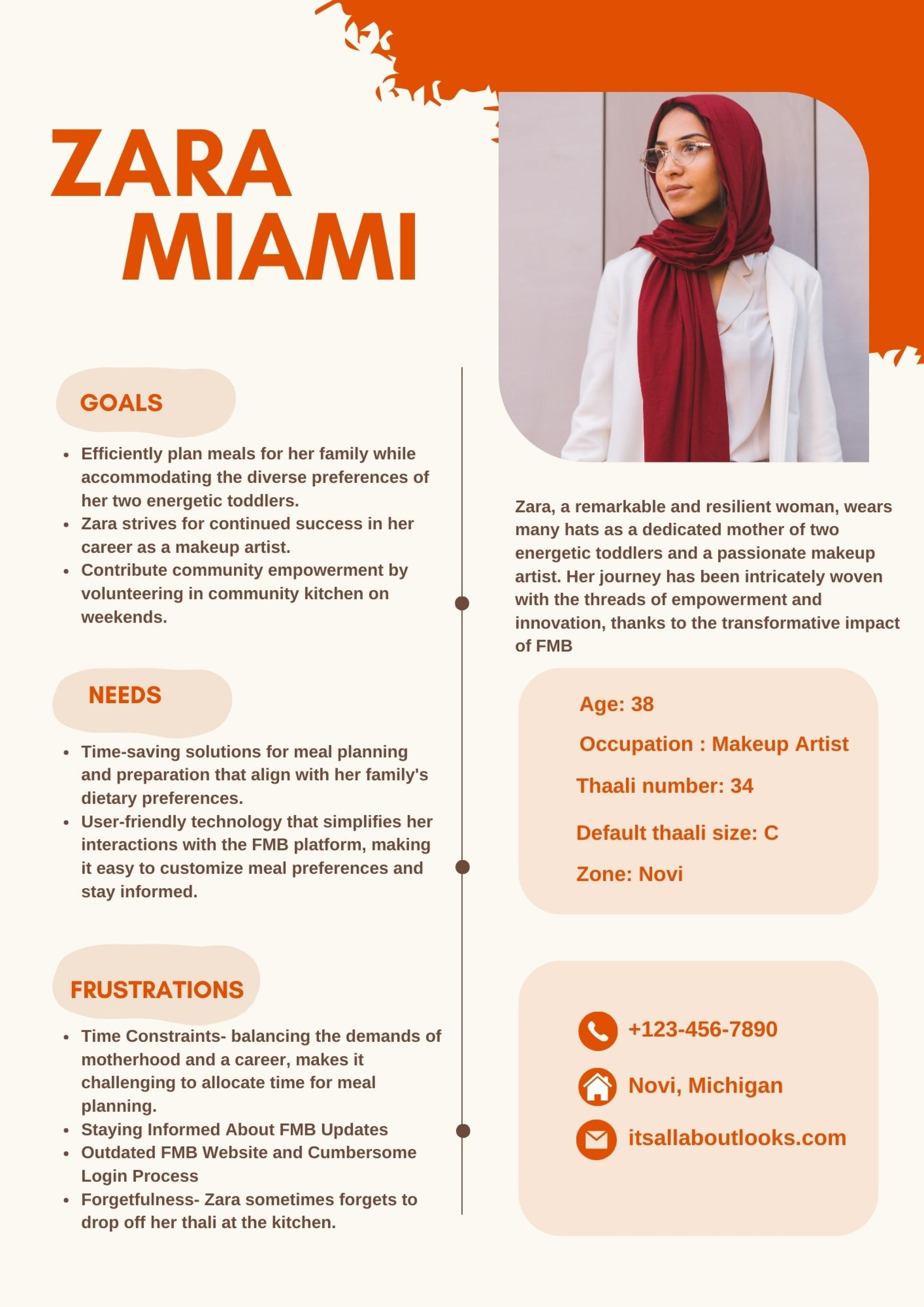
User Persona & Empathy Map
Insights into Zara's thoughts, feelings and the challenges she encounters have provided a deeper understanding of her perspective, guiding the design process accordingly.

How can we seamlessly convert the FMB website into a user-friendly app, ensuring effortless access and easy customization at users' fingertips?
How Might We…
Empowered by insights from user interviews and the “How Might We “ question as my guiding light, I started brainstorming ideas about the product goals and key features I wanted to incorporate into this new FMB app.
Ideas
INFORMATION ARCHITECTURE
Site Map
A visual idea of what my platform would consist of and what screens to prioritize
I created user flows to chart the various actions users might take. Additionally, task flows were designed to offer a clear, visual depiction of the tasks and decisions woven into the user's journey.
User Flow
Task Flows
DESIGN PROCESS
Keeping the product goals and key features in mind, I picked up my notebook and started sketching.
I further used, User and Task flows as essential concepts which guided the creation of wireframes by providing a detailed roadmap for each screen or interaction.
Sketching Wireframes
Lo-Fi Wireframes (Main pages)
Mid-Fi Wireframes
Presented main screens featuring key features to the FMB admin panel.
Shared insights into my design thinking process and the considerations shaping my decisions.
Incorporated valuable feedback from the panel, leading to additional iterations before progressing to high-fidelity wireframes.
Design Iterations
Transitioning from 5 star rating to a 1-10 rating scale with a slider
The expanded scale minimizes ambiguity, making it easier for customers to distinguish between their experiences.
Placing the feedback button prominently under the menu
Users are more likely to notice and engage with the button when it is positioned directly under the food they had, leading to higher participation rates in the feedback process.
Before moving to high-fidelity, I needed to decide how the product should be branded.
I picked orange as my primary color because it is known to stimulate appetite and evoke feelings of warmth and comfort, making it just the right choice!
For the app logo, I creatively depicted stackable containers, commonly known as tiffins, which are central to the platform's purpose of delivering meals.
DESIGN SYSTEM AND STYLE GUIDE
UI Design and Hi-Fi Wireframes
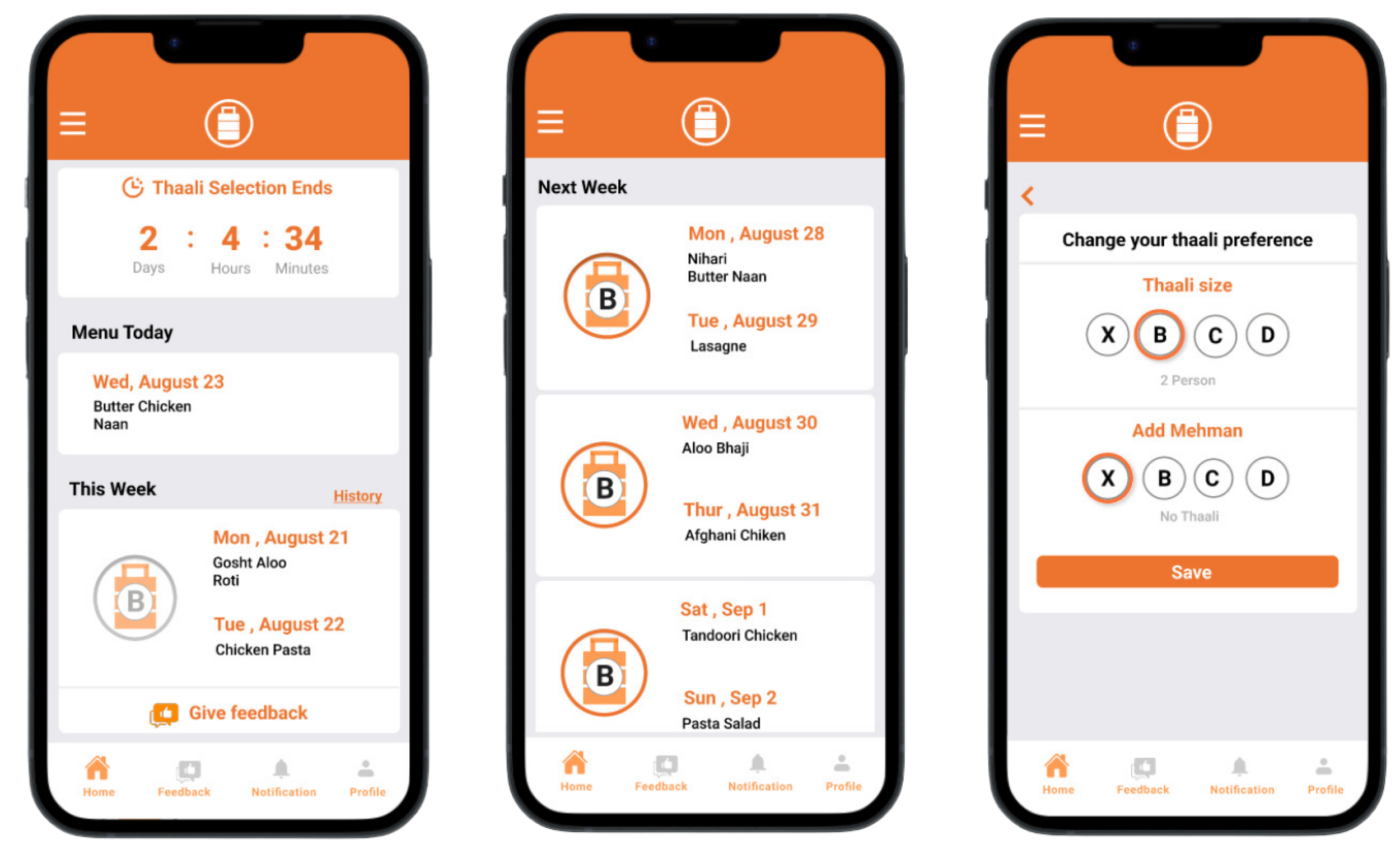
Key Features
To ensures that users encounter a familiar interface when updating their meal preferences, I maintained a consistent interactive design from current website
1. Optimize Meal Customization
Users can provide valuable feedback on the food anonymously, which facilitates better vendor selection and help keep the quality of food consistent through user ratings and comments.
2. Facilitate Feedback and Culinary Improvement
Users can easily connect with FMB admins and utilize the in-built calendar feature to select specific dates and request a temporary pause on your FMB service.
3. Improve Communication Channels
Access and edit personal profile details with ease.
View information such as container number, and assigned zone for a personalized experience.
4. Enable Profile Personalization
5. Notifications
Stay informed with timely notifications on menu updates or changes.
Click here to view Prototype

The beta version of the app, synchronized with the website's database, was strategically launched four weeks ahead of the official app launch.
The initial focus was on iOS users, leveraging the Test Flight application, to distribute the app, gather insights, and refine the user experience.
A total of 15 community members volunteered to actively engage with the beta app.
This presented a valuable opportunity to validate and optimize the app's design based on real user interactions and feedback.
USER TESTING
After user testing with beta app, there were only minor design improvements but it allowed for the identification and resolution of any technical issues or bugs by the developer.
The stats showed us that users were not actively filling out the feedback survey on the beta app.
Admins wanted a comprehensive understanding of dish preferences for better vendor selection.
Design Improvement
Implemented proactive reminders twice a week to encourage user feedback.
CONCLUSION AND SUCCESS STORY
The FMB app has made a profound impact on our community since its release on the IOS App Store and Android Play Store. With an impressive 170 downloads in the first week, it's evident that the community eagerly awaited a modern technological solution.
Recognizing its effectiveness, the FMB team has decided to retire the existing website, consolidating the community onto this efficient and user-centric platform.
NEXT STEPS
The upcoming focus is to streamline admin interface of the app, enable tasks such as:-
Menu updates
Addition of new households
Display menu ingredients with allergen information
Showcase daily feedback data within the app for admin members
This enhancement aims to optimize administrative efficiency and elevate the functionality of the FMB app.
“This App saves me so much time sifting through 100s of emails to search for volunteer sign ups and feedback surveys. Everything is just a tap away!"
View next project:
Netflix Sync Party UX/UI Design • User Research • Prototype


